If you’ve ever stood in front of your closet before a photoshoot whispering “I have nothing to wear,” you’re not alone. Most people think wardrobe stress is about style—the cut of a dress, a trendy shirt, the right shoes. But nine times out of ten, what makes an outfit photograph beautifully is the color: how it interacts with your skin, your surroundings, and the camera.
This guide is here to help you pick colors confidently and intentionally, and the great thing is that you can use this information not just for your photography session but for your everyday closet as well. We’ll talk about how color really works, how to read your own undertone, how to build a palette that works for a solo session or a family group, and why neutrals and jewel tones each have their moment.
Whether we’re shooting on an evergreen trail in Edmonds, along the cool-toned driftwood at a Puget Sound beach, or in the city photographing on the streets of Seattle, the right colors do something special: they keep the focus on your faces, flatter your skin, and harmonize with the scene so your photos feel timeless.
How we see color
Color isn’t “in” the clothing; it’s light bouncing off fabric into your eyes (and into my camera sensor). Our eyes have three kinds of cones (Special cells in are eyes that “read” different wavelengths of light) that let us perceive color. Our cones allow our brain to interpret these light waves as color, and we have one cone per color, red, blue, and yellow. Your brain then decodes that mix using something called the opponent process (it balances pairs like red–green and blue–yellow). That’s why complementary pairs—like red and green—feel vivid and balanced: they stimulate opposing channels in a way our brains find satisfying, but contrasting pairs such as blue and yellow, can feel loud and jarring.
Why colors change in different places
Two big effects make color slippery:
- Lighting changes everything. Overcast light (hello, Seattle!) is cooler and softer; golden evening light is warmer; indoor tungsten or cozy lamps are warmer still. Warm light will make colors and skin read warmer; cool light pushes them cooler. I always set white balance intentionally, but what you wear still casts color onto your skin and the people next to you, which is why I as the photographer always wear black’s, whites, or neutrals. I don’t want what I’m wearing to effect your skin tone or change the coloring of your outfit. Think about wearing a white dress next someone who is wearing a red shirt. your dress may come out a little pink in a photo.
- Simultaneous contrast. Put a color next to its opposite and both look richer. Put a color next to a very similar tone and it can look dull or muddy. This matters when we’re choosing clothing against a background—say evergreen trees (cool green) vs. a sandy beach (soft, warm neutrals).
What the camera sees
Modern sensors love mid-range saturation and good luminance contrast (light vs. dark). Ultra-neon colors can clip (lose detail) and throw color casts onto skin. Very dark-black outfits can go flat in shade, and very bright-white outfits can blow out in direct sun. The sweet spot: colors with controlled saturation, clear differences in value (how light or dark they are), and limited competing hues.
The Color Wheel
Think of the color wheel as a map. Here’s how to navigate it without needing a design degree:
- Hue = the family (red, blue, green, etc.).
- Value = how light/dark it is.
- Saturation/Chroma = how pure or muted it is.
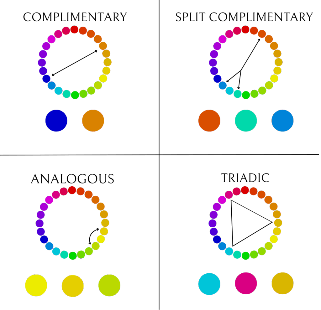
Complementary colors sit opposite each other on the wheel (red–green, blue–orange, yellow–violet). These pairings create high-energy harmony—great if you want pop, provided the values are well managed (one deeper, one softer) and the saturation isn’t maxed on both.
Split complementary = pick a color, then use the two neighbors of its opposite. Softer than a direct complement, but still lively. Example: if your dress leans teal, accents in soft coral and warm rose are gorgeous.
Analogous = colors next to each other (olive, moss, forest). Calmer and very PNW. Add a cream or warm tan to keep it from feeling too uniform.
Triadic = three colors evenly spaced (e.g., teal–marigold–plum). This can be stunning for larger groups if one color plays lead and the others are quiet accents.
Why do red and green “go” together?
Our visual system balances red–green channels. When you put them together thoughtfully (for example, deep wine with muted olive), your eye reads the pairing as complete. The trick is dialing value and saturation so the combo doesn’t scream “holiday.”
“Muted,” “Neutral,” and “Jewel Tones” (What Those Words Actually Mean)
Muted doesn’t mean boring. It means the color’s saturation is softened—typically by adding gray or a touch of the complementary hue. That’s how you get sage from green, dusty rose from pink, or terra-cotta from orange. Muted colors are camera-friendly because they don’t spill color casts onto skin as aggressively and they mix well with natural environments around Seattle and Edmonds.
Neutrals are colors that act like a quiet backdrop: ivory, cream, oatmeal, camel, taupe, greige, stone, charcoal, navy. Neutrals photograph cleanly, give the eye a place to rest, and let faces be the focal point. “Warm” neutrals (oatmeal, camel) glow in cool light; “cool” neutrals (stone, charcoal) can balance warm indoor scenes.
Jewel tones (emerald, sapphire, ruby, amethyst) have higher saturation and depth. They’re amazing when:
- The background is softer (foggy beach, gray driftwood, studio neutrals).
- Skin tones need richer contrast to pop.
- You pair one jewel tone with quiet neutrals and/or muted companions, not four different bright hues fighting each other.
When are jewel tones not ideal? Super bright midday sun, or on reflective fabrics can make them feel harsh. But in the PNW’s softer light, a single jewel tone often sings if it’s on a softer fabic.
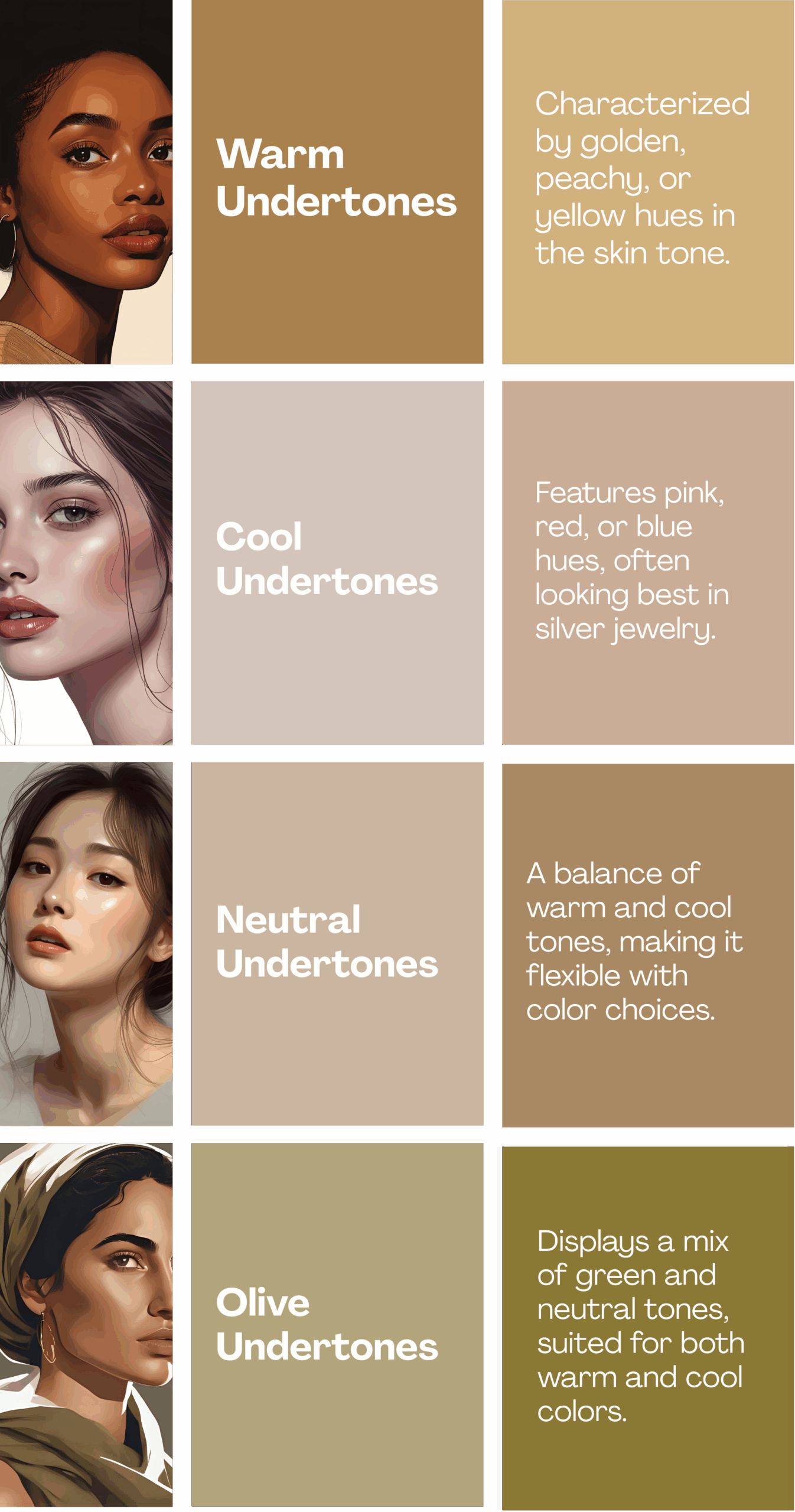
Your Skin Tone, Undertone, and What Actually Flatters
Overtone is what you see at a glance (fair, medium, deep). Undertone is the subtle temperature beneath the surface (cool, warm, neutral, or olive—a slightly greenish, often misunderstood undertone). For instance I am a fair olive which is not an easy skin tone to work with.
Quick at-home tests (use daylight near a window):
- White paper test: Hold a white sheet under your chin in indirect daylight. If your skin looks slightly rosy/blueish, you likely lean cool. If more peachy/golden, you likely lean warm. If it seems balanced, neutral. If it looks a touch greenish, consider olive.
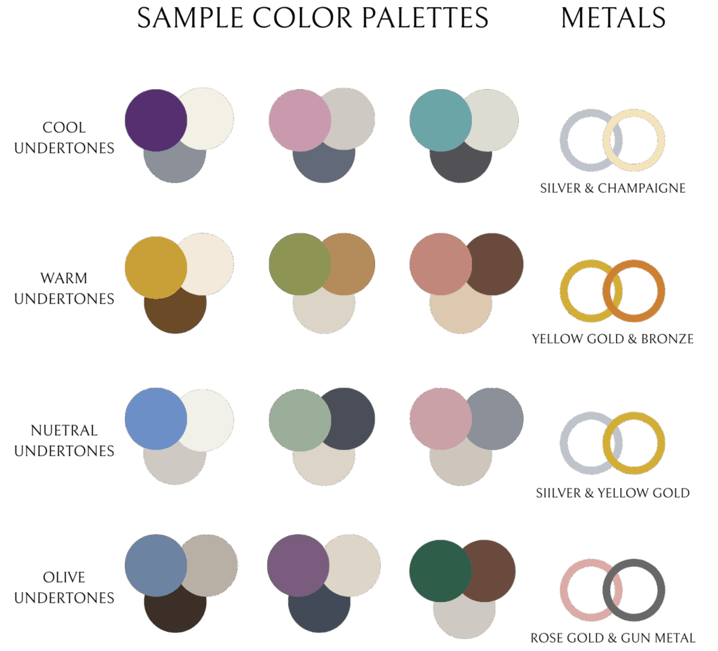
- Metal test: Silver reads best on cool; yellow gold on warm; rose gold and mixed metals often flatter neutral and olive.
- T-shirt drape: Try a true blue vs. a true orange tee (or towels). Which makes your face look brighter and more even? That’s a strong clue.
None of these tests are perfect (lighting and makeup matter), so use two or three together and look for a pattern. If you’re in between, neutral and olive guidelines are your friend. Learn more about finding your undertone here.
Color suggestions by undertone (always flexible—use what you love):
- Warm undertones: Olive, moss, sage, mustard, rust, terra-cotta, warm pink/peach, warm teal. Neutrals: warm creams, oatmeal, camel, toffee, greige that leans warm.
- Cool undertones: Blue, emerald, cool pinks/roses, plum, true navy, charcoal, icy pastels. Neutrals: cool grays, stone, crisp
- Neutral undertones: You can wear both warm and cool if saturation is moderate. Try dusty rose + sage, slate blue + cream, soft teal + stone, cocoa + ivory.
- Olive undertones: Rich jewel tones (emerald, sapphire, wine), deep teal, warm rose, charcoal. Avoid overly yellow creams; choose neutral or cool ivory instead. Sage + wine is a surprisingly flattering olive combo.
Makeup & color cast tip
If your outfit is strong (say, ruby or emerald), keep makeup undertones aligned (cool lip with cool dress; warm lip with warm dress). This keeps your skin from picking up a competing cast, especially in overcast Seattle light.
Building a Wearable Palette (Solo, Couple, or Family)
Think of your palette like a small band: one lead singer, one backup, and a rhythm section that keeps it all together.
- Choose your lead. One hue gets the spotlight (a dress, sweater, or jumpsuit).
- Pick a base neutral. Cream, stone, camel, navy, or charcoal keeps it grounded.
- Add one supporting color (a softer related hue or a split complement).
- Sprinkle micro-accents only if needed (a hair bow, scarf, or shoe).
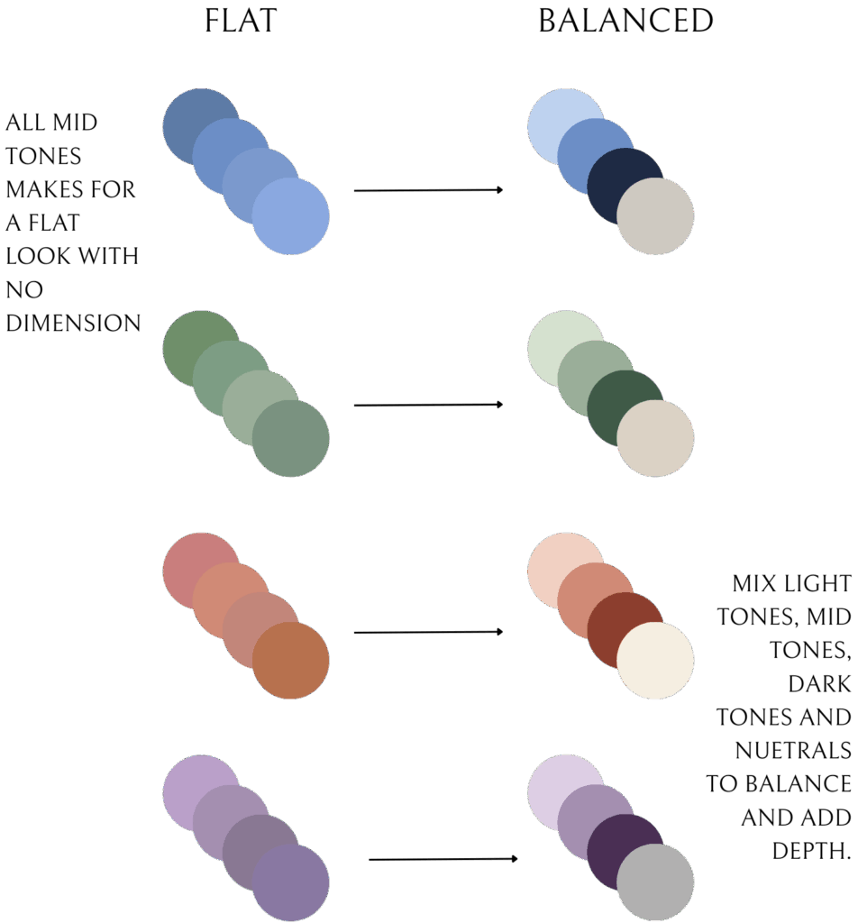
Balance value (light/dark) so outfits don’t all blend into one mid-tone. A variety of light, medium, and darker pieces gives shape and dimension on camera.
Family example (Edmonds beach)
- Lead: Dusty blue midi dress (cool undertone friendly).
- Base neutrals: Warm oatmeal sweater and stone chino for partner.
- Support: Sage cardigan for kiddo + cream knit texture.
- Result: Beach pebbles and driftwood echo these tones; faces glow without anything screaming for attention.
Family example (evergreen trail in Seattle)
- Lead: Warm rust or wine dress (warm/neutral undertones) OR deep teal (olive/cool).
- Base neutrals: Camel or charcoal layers.
- Support: Muted olive or soft blush for kids.
- Result: The greens in the background feel lush, your palette stands out without clashing.
Studio example (neutral backdrop)
- Lead: Emerald dress or sapphire blouse.
- Base neutrals: Ivory and stone for others.
- Support: Dusty rose or moss accessory.
- Result: Jewel tone shines, skin looks luminous, and the whole set feels editorial.
Why Neutrals Photograph So Well
- They love skin. Neutrals don’t reflect strong color onto faces, so skin looks clean and even.
- They suit PNW backdrops. Sand, stone, wood, and misty skies are neutral—your palette belongs to the scene.
- They play nice with editing. Neutrals hold detail and avoid weird color noise, so your gallery feels consistent.
- They’re timeless. Trend colors come and go. A warm camel sweater or cream dress will look good now and in ten years.
Pro tip: Pair one colored piece (muted sage, dusty blue, warm rose) with two neutrals (cream + stone or oatmeal + charcoal). It’s the fastest route to effortless harmony.
When to Use Jewel Tones (And How to Keep Them Elegant)
Use them when:
- You need a strong lead color in a calm setting (studio, foggy morning, gray beach).
- Your skin/eye color resonates (emerald on hazel/green eyes; sapphire on blue eyes; wine on deep complexions = wow).
- The rest of the group wears quiet neutrals.
Keep them elegant by:
- Avoiding multiple jewel tones competing at once (emerald + ruby + sapphire = much).
- Choosing matte or softly textured fabrics to prevent glare.
- Letting value do the work: deep jewel tone + light neutral (emerald + cream) is chef’s kiss.
Complementary Palettes That Work in Real Life
- Wine + Olive + Cream (evergreen trails, fall in Seattle)
- Dusty Blue + Camel + Ivory (beach boardwalks, driftwood)
- Teal + Warm Rose + Stone (urban brick, Pike Place textures)
- Sage + Terra-cotta + Oatmeal (garden, greenhouse, golden grass)
- Plum + Slate + Soft Blush (studio neutrals, moody indoor light)
Notice the pattern? One color leads, one neutral grounds, one support softens. Nothing neon, nothing shouting.
Common Pitfalls (And Easy Fixes)
Pitfall: Everyone wears the same exact color.
Fix: Keep the family of color (say, blues), but vary value (light denim, slate, navy) and texture (knit, linen, gauze).
Pitfall: A neon “fun shirt” throws color onto faces.
Fix: Swap for a muted version (dusty coral instead of neon coral) or layer with a neutral jacket to reduce spill.
Pitfall: Outfit matches the background too closely (olive dress in dense green forest).
Fix: Add value contrast (cream cardigan, camel hat, light scarf) so you don’t vanish into the trees.
Pitfall: Too many patterns.
Fix: Limit to one subtle pattern and keep everyone else in solids or near-solids.
Pitfall: All black in deep shade.
Fix: Mix in charcoal, stone, or cream to create separation and save detail.
A 10-Minute Color Plan (Before Any Session)
- Choose your lead: Pick the piece you love most (dress, sweater, jumpsuit).
- Check undertone alignment: Hold it up to your face in daylight—does your skin look brighter and even?
- Set the base neutral: Cream, stone, camel, navy, or charcoal depending on location and light.
- Add one supporting color (muted or split-complementary).
- Balance value: Make sure you have light/medium/dark in the mix.
- Do the group test: Lay everything on a bed. Squint. Anything screaming? Desaturate it (swap for a muted version) or remove it.
- Camera reality check: Avoid super shiny fabrics, super neon hues, and super tiny high-contrast patterns (they can moiré).
- Done. Walk away. Trust it.
FAQs I Get All the Time
“Can we do one bold color?”
Yes—one, but check that it works with your skin tone and doesn’t color cast. Keep everyone else in neutrals or soft companions.
“Are jeans okay?”
Absolutely. Mid-wash to dark denim pairs beautifully with cream, camel, slate, and dusty hues. Super light, high-contrast whiskering can distract, so keep it simple.
“What about black and white?”
Black can feel flat in shade; white can blow out in bright sun. If you love them, pair with supporting tones (cream, stone, camel) and mind the light.
“I’m between sizes; should I prioritize fit or color?”
Fit first—always. Then we finesse color within that silhouette.
Putting It All Together
- Let undertone guide your hue temperature (cool vs. warm).
- Use the color wheel for structure (complementary, split, analogous).
- Control saturation (muted = camera friendly).
- Balance value (light/medium/dark).
- Keep neutrals as your anchor.
- Let one color lead, and let everything else support.
When in doubt, text me a quick flat-lay photo of your options by a window, and I’ll help you pick the winning palette. It takes two minutes and saves a lot of second-guessing.
Great photos don’t come from the trendiest outfit or the fanciest shoes. They come from color harmony between you, your surroundings, and the camera. Let one color lead, let neutrals ground it, and keep the balance simple. Do that, and your photos will feel timeless, effortless, and all about you.
Ready to put these tips into action? Contact me today to book your session and let’s make your photos unforgettable.


Be the first to comment